The Top 5 Most Common Home Design Mistakes
If you’ve been a Playbook reader for quite some time now, then you’re probably already familiar with my design mistakes series. I dive into the most common home design mistakes I see people making in their own homes and offer tips and advice to fix them.

Now, I don’t want anyone to ever think they’re doing something wrong. At the end of the day, it’s your home and if you love it, that’s all that matters! But if you are looking for ways to improve the overall look and feel of a room, then rectifying these mistakes will give your home a more polished and well-designed look.
Common Home Design Mistakes – Video Series
I just finished sharing a 10-part video series all about the most common design mistakes. It was fun to showcase all of my best tips in video format. You can view them all over on Instagram right here.
You can also peruse the dozens of blog posts I’ve written about common home design mistakes right here. Today, we’re going to take a look at the top five most common home design mistakes and how to fix them. If you nail the fixes for these top five, I promise your home will look much better, overall.
The Too-Small Rug
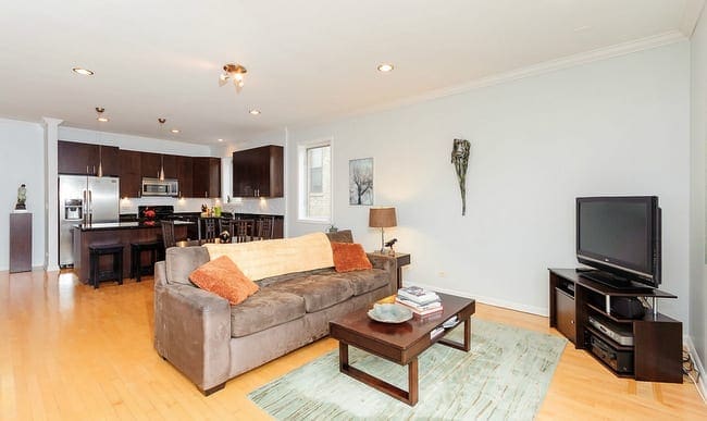
The Design Mistake: You guys knew the too-small rug mistake was coming, didn’t you? It’s something I see out “in the wild” more often than anything else. People buy a 5×8 rug and place it in front of their bulky sectional. It then looks like a postage stamp on the floor!
The Fix: With rugs, bigger is usually better! It’s rare that you should ever purchase something smaller than an 8×10 unless the room is very small.
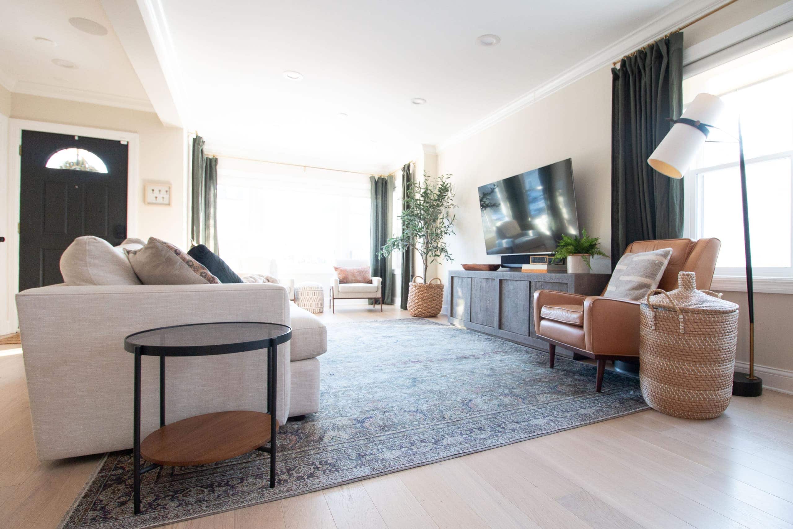
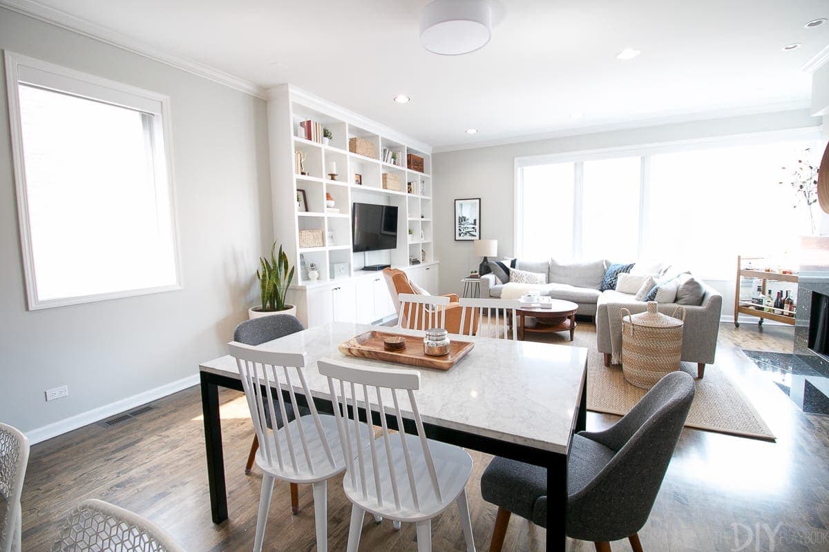
- Living Room: Usually 8×10 or larger. At least get the front legs of the furniture (especially the couch) onto the rug. We have this 9×12 rug in our living room.
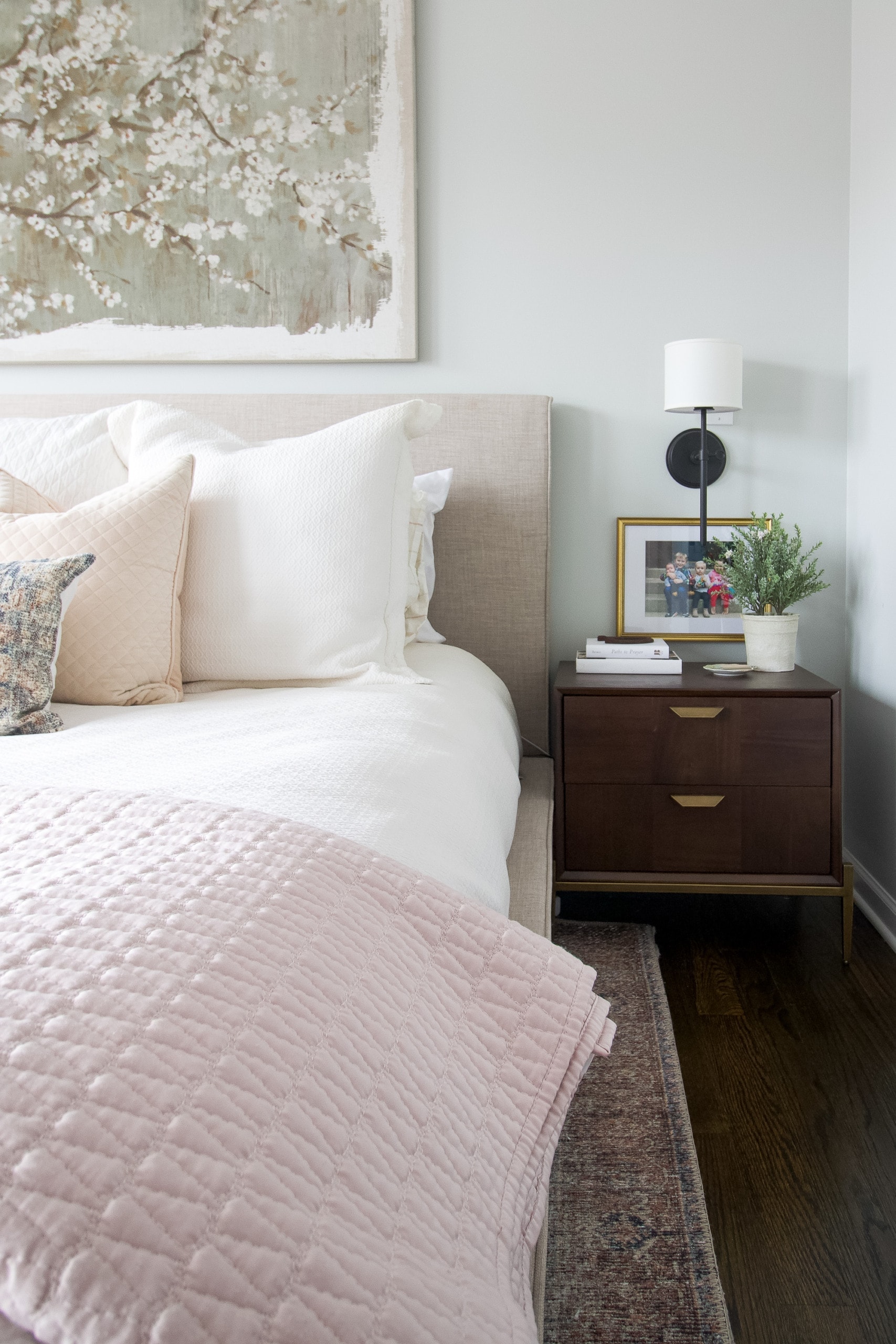
- Bedroom: Queen bed = 8×10 rug. King bed = 9×12 rug. We have this 9×12 rug in our bedroom.

I share much more about this topic in this blog post. And if you need help choosing the perfect rug for your home, this blog post breaks down everything you need to know about rug buying.
The Short & Stumpy Curtains
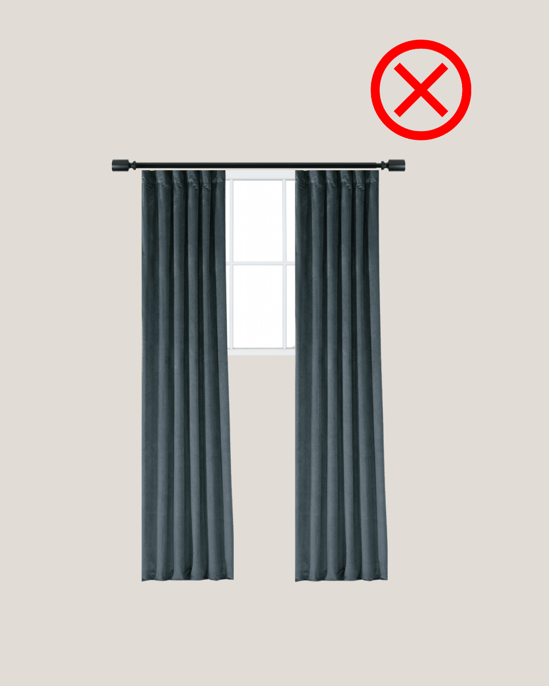
The Design Mistake: You buy regular curtains at the store and place the rod directly above the window and right on the outside of the window casing. The result? Your room looks smaller and you block natural light with the curtains, even when they’re open.
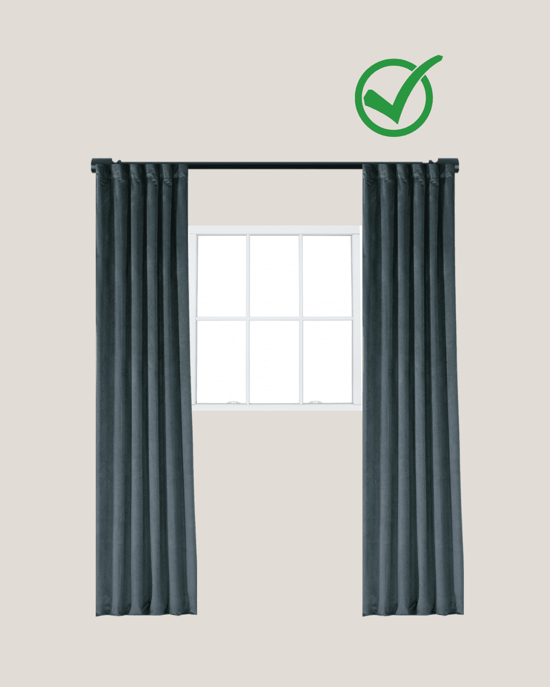
The Fix: Place your curtain rod a few inches below the ceiling and then 8-12 inches off the sides of the window for the width. You will likely need to buy XL curtains and get them hemmed. And you may need extra curtain panels too. This is okay! It will look fuller and much better overall. Oh, and I’m a fan of having my curtains just “kiss” the ground. No flooded curtains and no puddling.
You can dive deeper into this topic in this blog post.
The Too-Small (or Oversized) Furniture & Art
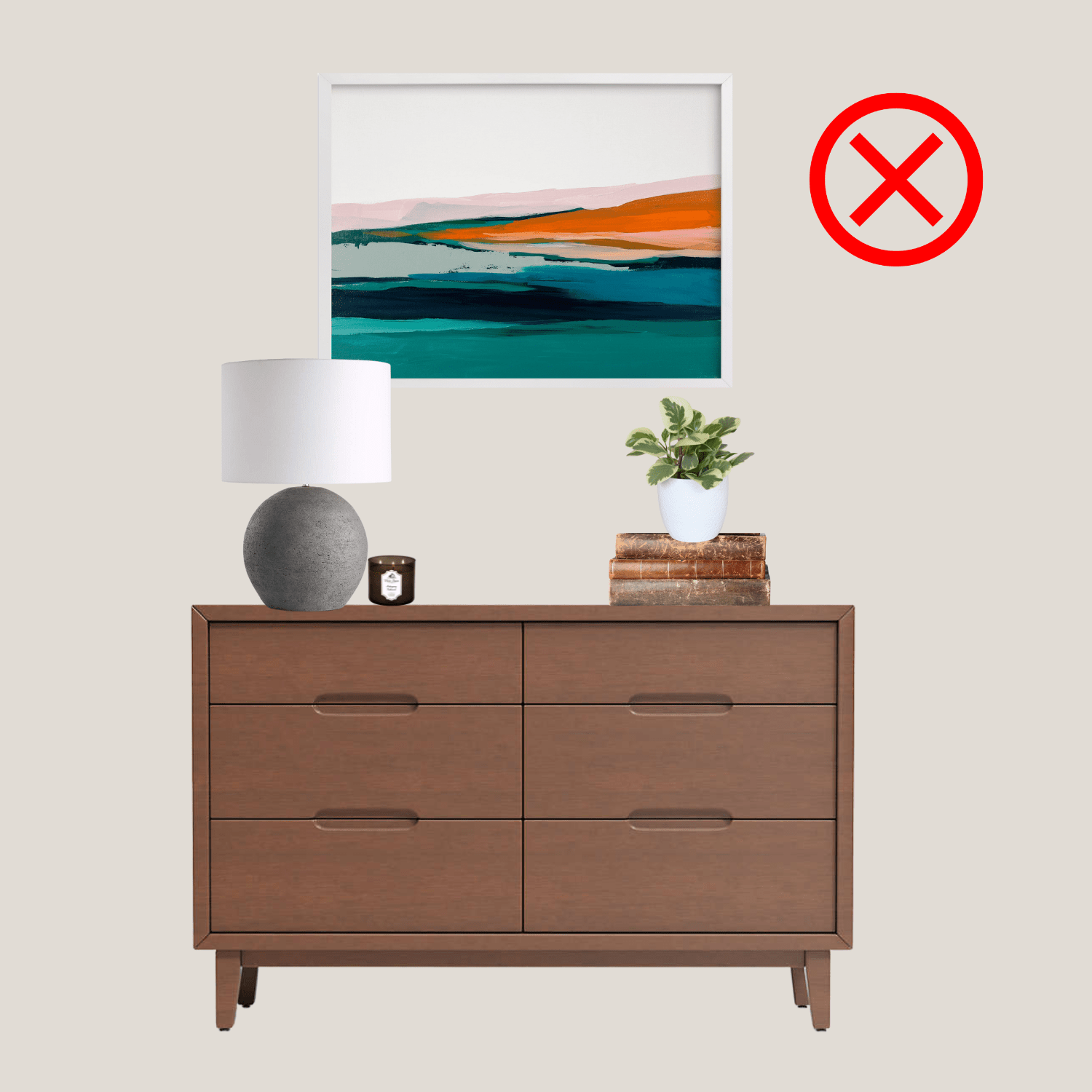
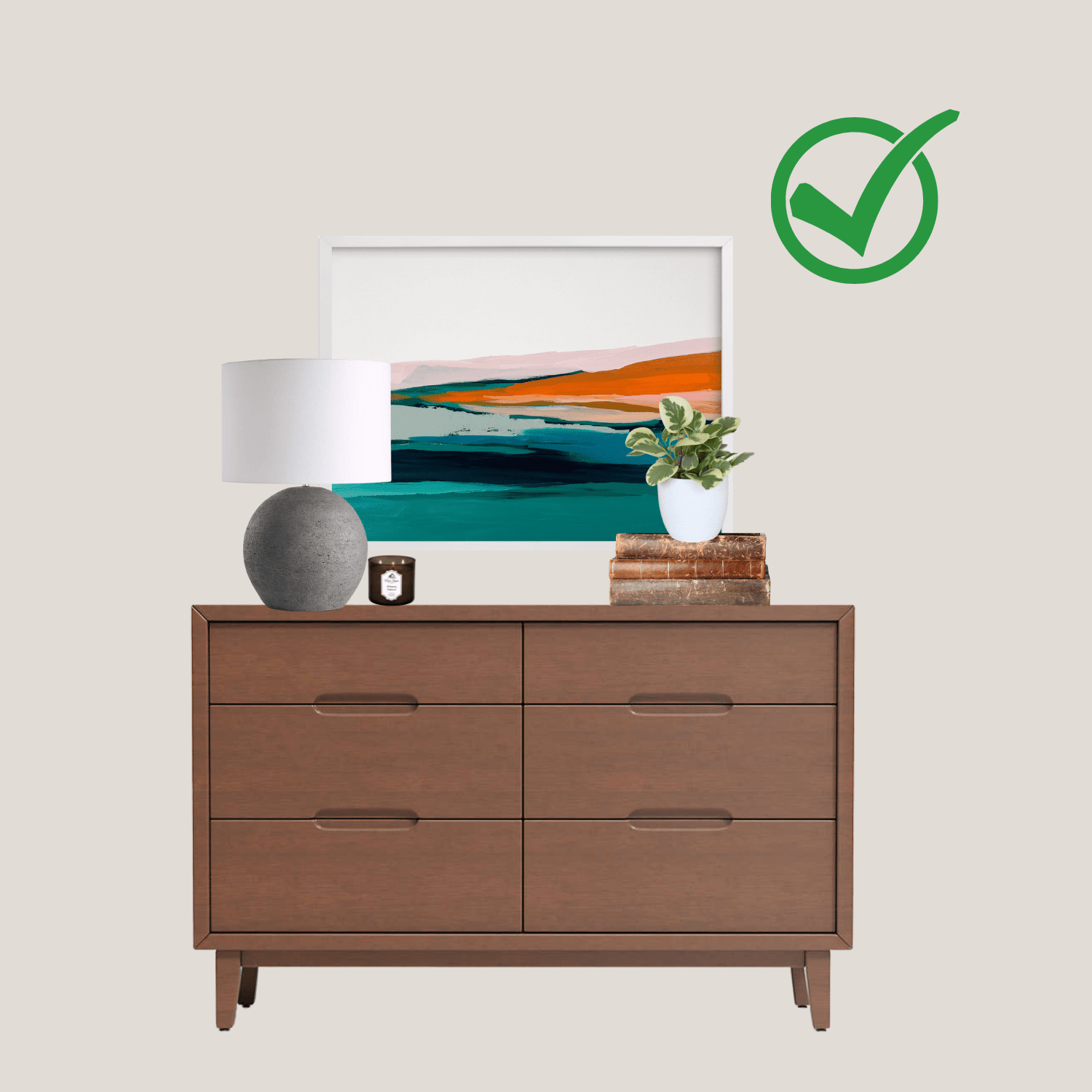
The Design Mistake: You have a large room and fill it with a bunch of tiny furniture. The end result feels cluttered and uncomfortable. Or, you hang tiny art pieces on the wall over your bed and wonder why it feels off.
The Fix: A large room usually calls for large furniture. Also, use the 1/2 to 2/3 rule. Let me explain…
- Artwork: If you’re hanging a piece over a bed, couch, or dresser, make sure it fills up at least 1/2 to 2/3 the width of the space. If you want to showcase smaller pieces, then group a few together to create this effect.
- Furniture: Coffee tables should be 1/2 to 2/3 the width of the sofa.
- Lighting: If you’re choosing an overhead light fixture for an entire room, there’s a different equation to follow. Measure your room’s length and width (in feet) and add these two numbers together. This number is the ideal diameter for your light fixture. For example, a 10×10 room would need a 20″ diameter chandelier. This blog post shares all of my rules for lighting.
If you’re buying a new piece, I always recommend using painter’s tape to tape out the dimensions on the ground or wall before purchasing. That way, you can see how it feels in proportion to the other items in the room. For more examples and details, head to this blog post.
The Too-High Art
The Design Mistake: You have a new, gorgeous piece of art to display but you hang it up high on the wall. No one can actually see it well without craning their necks.
The Fix: Here are some general tips to get your frames and art hung at the correct height on your walls.
- Ditch the “Eye Level” Rule: This doesn’t work if you’re tall or your ceilings are low. Instead, think of the wall in 4 sections vertically (from the bottom to the top). Then place your art in the 3rd section up from the floor. Don’t display pieces in the 2nd or the 4th…that’s when you’ll be in the too-high or too-low territory!
- Hanging a Grouping: If you’re hanging a gallery wall, then you want to think of the entire collection as one piece of art. Therefore, the very top and the very bottom of the grouping shouldn’t be hung too high or too low.
- 57-60 Inches Often Works: In general, you can place the center of the piece about 57″ to 60″ off the ground. This doesn’t work for every situation, but it’s a good place to start when hanging your piece.
- Above Furniture: When hanging a piece above a couch or a dresser, there are more things to consider. Typically, the bottom of the artwork should be 4-8″ above the piece of furniture. Most people hang pieces way too high and it ends up looking disjointed.
For more examples of this common home design mistake, head to this blog post.
The Trendy Home Devoid of Personality
The Design Mistake: You follow design trends and implement them all in your home. The result? Your home doesn’t feel like you and you’re never satisfied with how it looks because trends are always changing.

The Fix: Ignore the trends and figure out what you actually like. Peruse catalogs and Pinterest for inspiration and note the common elements you’re drawn to, over and over again. Light and bright spaces? Dark and moody? Find the spaces that make your heart skip a beat and incorporate those elements into your home. Plus, don’t forget function! We have a busy family of four that includes two young kids. I’m always on the hunt for durable pieces that can survive rough handling.

Also, don’t forget to add pieces that tell your story. Someone should walk into your home and get a glimpse into the lives of the people who live there. Skip the generic decor from Target and instead display your memories. I just created a video with lots of ideas to do just that!
Any Other Home Design Mistakes to Tackle?

This series has been such a fun one to work on over the years. I’ve heard from many of you who have learned a lot from these blog posts and deep dives into interior design rules. I often think I’ve tackled every topic, but then another one comes along. Anything you want me to cover in my next design mistakes post? I’m all ears!
You may also like…


Hey there!
I’m Casey Finn, the voice behind The DIY Playbook. I’m married to Finn & mom to Rory and Ellis. Together we’re creating our dream home in Chicago, one DIY project at a time.